
3 column into 2 column conversion
Now, you can convert your 3 column site into a 2 column site without losing any of the custom formatting you've built up using the Site Designer!
This is done by writing CSS code into the Add Custom CSS box.
It's pretty easy to do, and the process is completely reversible! If you want to go back to the old 3 column design, all you do is remove the extra code from the Add Custom CSS box.
What does it look like?
Here's an example of a site we converted.
Click on each of the images below to enlarge in a new window!


Often, we'll write the code onto a single cloned page first, that isn't visible to your visitors. That way, you can make changes to the look before it goes live across your site.
Just 2 further changes were made to this template after it was switched to 2 columns.
- A larger version of the image was added, so that it stretched fully from one side of the page to the other.
- The size of the font was increased over the whole site.
You can see the 2 column site has a much more open and accessible feel.
Why should you convert to 2 columns?
1. It looks better on the desktop
Most sites use the third column on a BB2 site for some type of site-wide repeating content. It's not wide enough for content, so it is often used for
- thumbnail navigation links
- selling e-books and other digital products
- Adsense ads
Unfortunately, visitors quickly learn to reduce the attention they give to repeating content.
Picture links work quite well, and can become a source of secondary navigation. But most other content in this column, particularly written and advertorial content, is frequently ignored.
In contrast, a 2 column site looks cleaner. There is more room for text, and the navigation is invariably larger and easier to read. The readers' attention is directed back onto your content or onto your Most Wanted Response.
2. It works better in mobile.
Mobile usage is accelerating rapidly.
The standard Mobilize It! layout places the Navigation and Extra Columns together at the foot of the page.
The navigation buttons are often small and difficult to use.
It's hard for the user to maintain attention in such a crowded space!
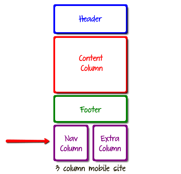
The layout diagram above shows how the Nav Column and Extra Column are positioned side by side at the bottom of the mobile page.
In contrast, on a 2 column site, the Navigation Column sits on its own.
There is no distraction from the Extra Column.
The Navigation buttons can be made larger and much easier to use.
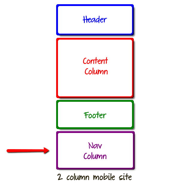
This kind of layout is far easier for the mobile user to navigate.
Other ways to convert from 3 columns to 2
There are 3 other ways that a 3 column site can be converted into 2 columns.
Using the 3 column version of your existing 2 column template
In the Site Designer gallery, you can usually find 2 column versions of your existing 3 column design.
However, if you change to a new template using this method, you will lose all the formatting and styling you've done so far.
Changing to a 2 column Custom template
Alternatively, you can switch your 3 column template to a clean 2 column Custom template, 1000px wide.
Again, any previous formatting you have done with the Site Designer will be lost.
Following the intructions on the SBI forums in this thread
Follow the instructions given on this thread in the Solo Build It forums. Here's the link.
http://forums.sitesell.com/viewtopic.php?f=57&t=178709&st=0&sk=t&sd=a&start=15#1184827
However, almost all Solo Build It templates were individually built. So, the code works for some sites but not for others.
Give it a try!
You can always come back here if you get stuck!
Contact Us
If you'd like to talk to us about converting your 3 column site into 2 columns, just get in touch via our Contact page.
We'll get right back to you!